
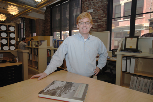
Walls cannot speak but a well-designed office could make the difference between closing a deal and not. Architect John Grosvenor knows this quite well. When he renovated a 19th-century bank into his office he spent a lot of time, money and effort to save the decorative skin of the vault and incorporate it into the entryway. Visitors need not go far to see that Grosvenor understands how to integrate historic elements into a modern office.
Grosvenor, a managing partner at Newport Collaborative Architects, said it is impossible to know how many clients picked him because of his office, but there is a reason his firm often tries to bring prospective clients to its headquarters.
“I think if we get them in the building we always feel better,” Grosvenor said.
Donald Powers, principal at Donald Powers Architects in Providence, was more blunt.
“We have found that our space is probably our most effective marketing piece,” he said. “If we can get potential clients here and see our physical space we suddenly somehow become real.”
Powers made a conscious decision to utilize bookshelves as dividers between workspaces in the office. The intent, he said, is to create a library-type atmosphere that presents an image of a company always learning and always reading up on the latest design techniques. It also serves as a subtle way to communicate a corporate priority that continuing education leads to better projects. And clients always feel better about working with well-educated architects, Powers said.
Designing a building to reflect the tenant’s brand is nothing new. Retail chains have been doing it for decades. Frank Lloyd Wright recognized that well laid out buildings could use carefully placed windows as natural air conditioning to encourage visitors to stay. And office executives picked up on the importance of design at least a decade ago as a way to entice jobseekers to accept a job offer during times of competitive hiring. Technology companies in particular followed the lead of the likes of Google and sought to design physical spaces with a hip, fun and stylish appeal.
Today, the lavish days of no-holds-barred construction and fancy architecture may have gone the way of a bull stock market, but architects in particular remain sensitive to how job applicants perceive a space.
That insight has seeped into other industries as well. Starting in the late 1990s, firms saw that retail marketing tricks could work just as well selling accounting services as big-screen televisions. And during the good days money was no object. Executives started bringing in their marketing departments to design meetings.
“Finally people woke up and realized what we have been telling them for years – that your physical space matters,” said Marie Fitzgerald, director of interior design at Symmes Maini & McKee Associates in Providence.
Fitzgerald said few companies want to display a “Dilbertville” appearance to their employees or to potential customers. Major companies work with architects from the get-go to match their walls, windows, carpets and the like to the corporate image. Fitzgerald pointed to the recently completed Blue Cross & Blue Shield of Rhode Island headquarters in Providence as an example of integrating a marketing image into a building.
In an effort to present a health-and-environment conscious image, the health insurance company included a fitness center, bicycle racks and energy-efficient ventilation systems in the building.
The basic design can also impact the perception of a company. Fitzgerald said an office design that puts private offices in locations with big windows and great views and leaves most employees far from sunlight creates a very different impression than an office where most employees have access to nice views.
To portray the right impression, architects do a lot of questioning.
“We’re asking, ‘What do you want to portray? What’s your personality? What’s your culture?’ These are all very important things in support of a brand,” said Henry Cugno, vice president of interior design at Vision 3 Architects in Providence.
At United Way of Rhode Island, executives charged Vision 3 with crafting a design that reflected an image of serving the community and becoming a central part of the Olneyville neighborhood. Architects took the request and came back with plans calling for a lobby area and conference rooms easily accessible to the public and designed to host public events like flu clinics, blood drives and gallery showings. Since United Way opened shop in the new space in June 2008, it has allowed numerous civic groups to utilize it.
The nonprofit organization also took pains to keep its building from appearing too showy, lest donors think United Way was squandering money. The organization also made the conscious decision not to use general contributions to fund the project.
And while United Way branded its building as a community center, at Providence law firm Taylor Duane Barton & Gilman partners looked to create an office that turned prospective clients into paying customers. The firm told Vision 3 it considered itself an expert law firm, but also one composed of young, hip lawyers ready to find innovative solutions to legal problems.
To convey that impression, Vision 3 dismissed the idea of the traditional, dark mahogany paneling, the storied-looking portraits of the firm’s partners and the library-style desk lamps with those little gold chains. Instead the architects designed a lobby with bright hardwood flooring, white walls, high ceilings and red-glass panels separating the lobby from a conference room.
“The hope here is someone stepping off the elevator for the first time, not having met us, gets an impression of quality but also contemporary thinking as well,” said Bob Shindell, a partner at the firm.
When Shindell and fellow Taylor Duane partners Frank Connor and Sheri Pizzi started looking at office space two years ago, they told their agent the new office had to include the ability to create a reception area that left an impression. Upwards of 50 people a week visit the firm, and lawyers do not want them turned off from a potential deal because of a drab, unprofessional-looking space.
The firm is still tinkering with the space it moved into Sept. 1 and adding the final touches, but Connor said the new look has already boosted morale among employees and impressed visitors.
“Now for the first time in a really long time we’re proud to have the clients come visit us,” Connor said. •